Banner Design Tips - Street Light Pole, Stadium, And More
PAGE
By PAGE Editor
Street Light Pole Banners
If you're considering purchasing a street light pole sign, you need to consider several things before you order one. First of all, make sure that the pole is the right height for your sign. If you order a sign with a shorter height, it may appear smaller than it really is. Another consideration is the distance of the pole from the roadway. Finally, think about the aesthetic of the pole.
It is important to have a large message that's easy to read. Well-designed street light pole banners will make your outdoor space look beautiful and inviting. You should also use bold fonts and large font sizes. A professional graphic design team can help you with the overall design. If you're unsure of how to make a street light pole sign stand out in a crowd, check out some design tips below.
Stadium Banners
Having an organized system for storing stadium signs is important. This way, you can keep track of what size signs you have and where they will be placed, including in the outfield. A dry-erase board or inventory management tool can also help you organize your signs. Another helpful tool is an online proofing and production website.
This will allow you to upload and make changes to your files, as well as receive timely information about sizes, materials, and quantities. A good sports team branded banner like these will attract people to come back again. Good customer experiences translate to word-of-mouth marketing.
Keeping your print materials consistent will attract your ideal customers. A well-presented stadium is an essential aspect of attracting professional sports teams. This branding will help you draw in more sponsors, as well as attract more fans. Stadium signs can help you achieve this.
Parade Banners
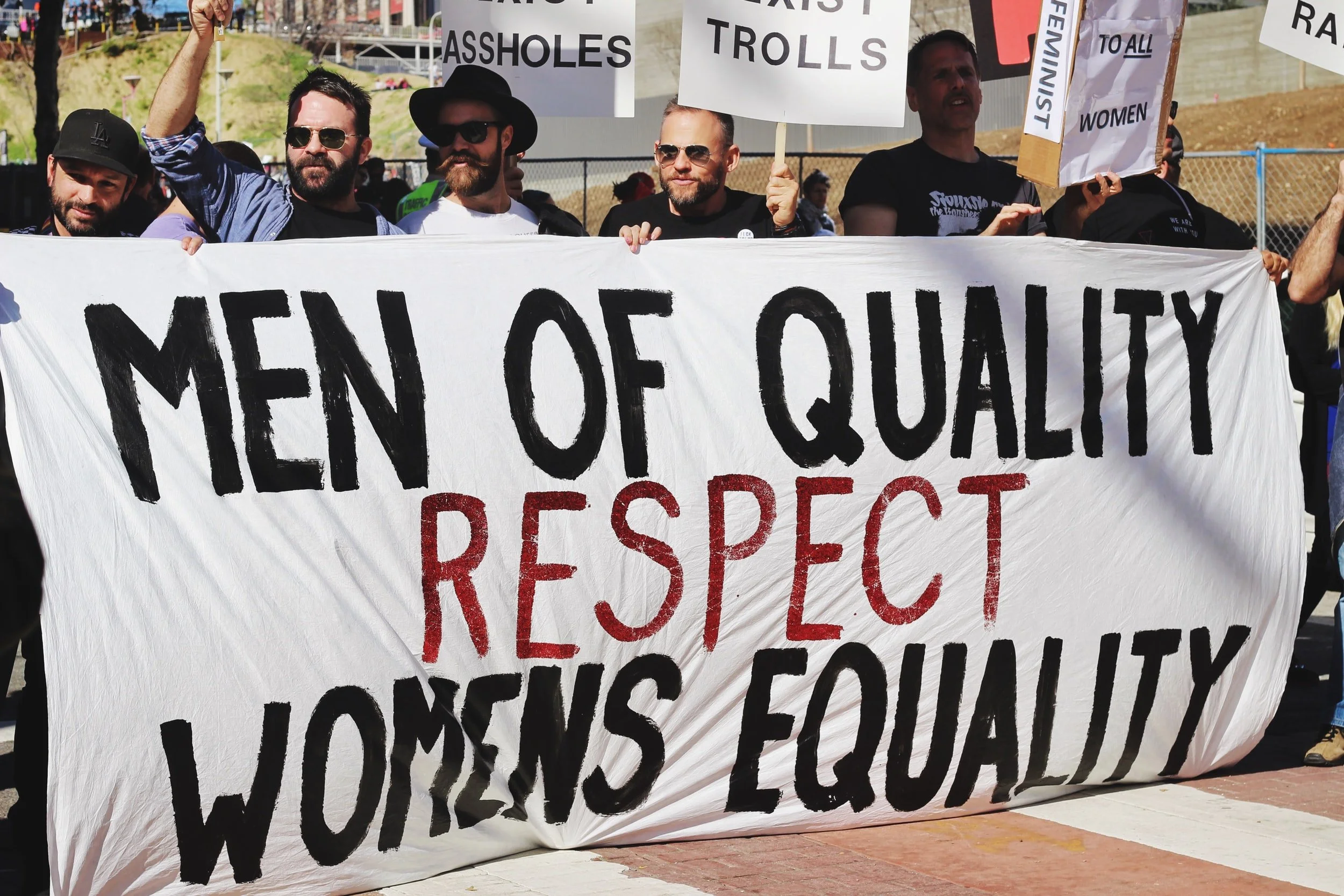
When it comes to creating a parade sign, there are many design options available. Fabric, foam, and paint are common materials for parade signs. Fabric signs are easy to decorate and can be ironed for a professional look. If you're using fabric, you can also purchase permanent fabric glue to attach the letters to the sign.
Fabric paint is another option, but it will run if it gets wet during the parade. When designing a parade sign, keep the bottom edge free from excessive tension. A sign that is too tightly folded may distort and be illegible. Also, make sure the sign has enough room to fold over at the top.
The top edge of the sign should have a loop in the middle that can hold a thick wooden dowel or PVC piping. If the top loop is not big enough, add a thinner wooden dowel at the bottom. Lastly, when designing a parade sign, make sure to use a legible font. Avoid using decorative fonts such as Verdana or Arial.
A good choice is Helvetica. These two types of fonts will ensure the readability of the sign. They can also be used in contrast to black text. You can mix and match these fonts. You can also choose a simple, non-decorative font with a decorative one to add flare.
Store Banners
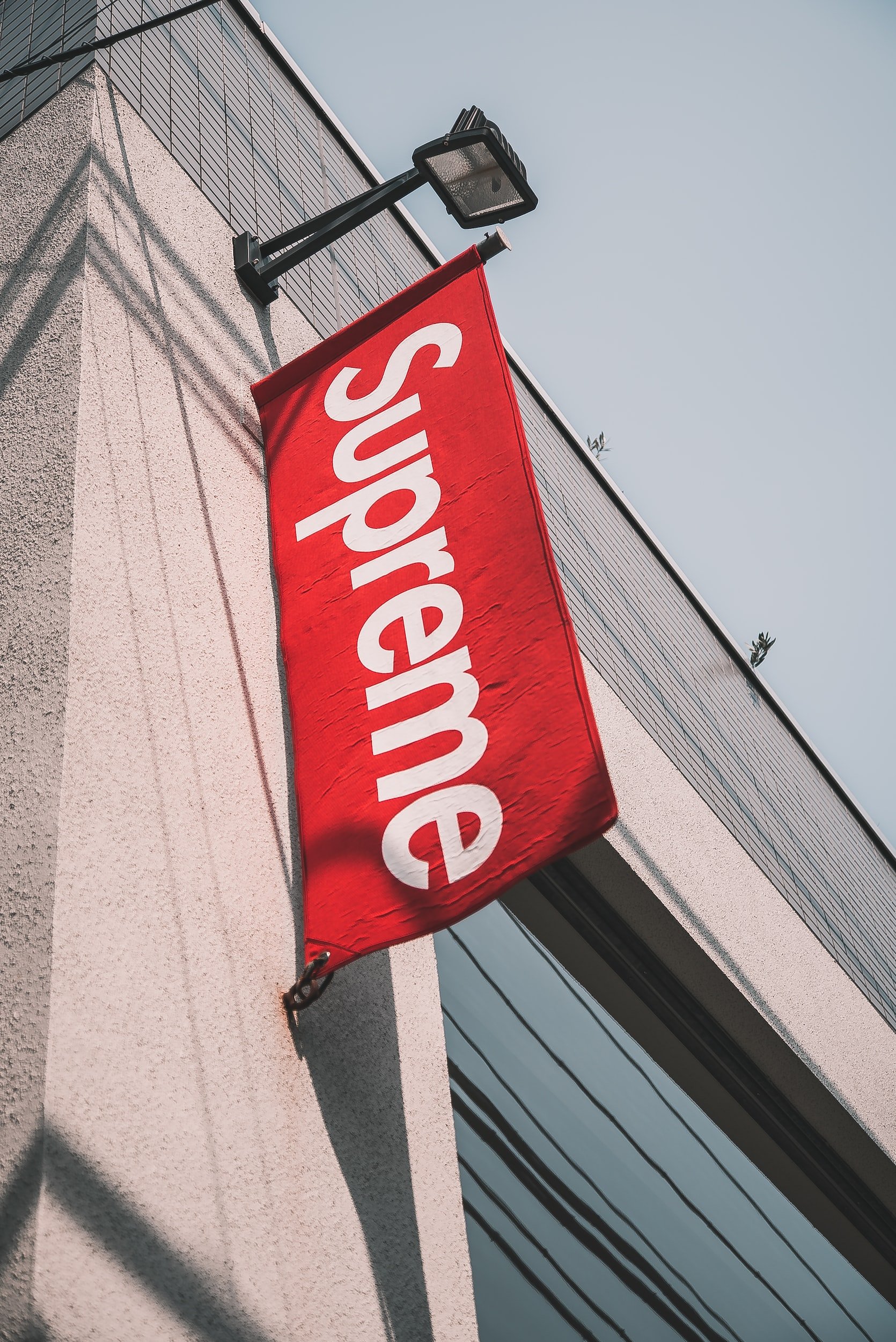
To create a store sign, start by determining the most important part of the ad - the cover photo. A good cover photo reflects the personality of the shop, so it should match the theme of its products. For example, if your store offers Halloween-related products, the cover photo should suggest the same theme.
For high-quality, customized signage, explore banners printing services to bring your store's look to life with professional design and print options that match your brand perfectly.
The sign should be short and concise to communicate the most important information. Using multiple product images can be distracting to your target audience, but you can make it shorter and more effective by using only one. Another important element in the sign is the copy. The tagline (https://en.wikipedia.org/tagline) should represent your brand, such as "Say it with Nike."
Make sure to include a clear title or subtitle text to be included. Keep the copy short and to the point. Try to avoid making the text too busy or distracting for the customer's attention. However, it is essential that the sign's content be visually appealing. Listed below are some tips for designing a store sign.
Keep your message short and sweet. Many people won't give your sign more than a quick glance, so keep it short and sweet. A simple sign with limited text is more effective than a long one with too much information. Adapt your sign to the elevator pitch of your target audience.
This will help your banner catch their attention and make them want to click. If you're still having trouble coming up with a short and sweet message, consider creating a more attractive banner. The placement of your store banner is crucial. If the banner is in the middle of a crowded parking lot, it may be impossible for pedestrians to read it for long.
HOW DO YOU FEEL ABOUT FASHION?
COMMENT OR TAKE OUR PAGE READER SURVEY
Featured






SMCP has appointed Linda Li as President and CEO of North America, signaling the Group’s intensified focus on omnichannel growth, full-price retail strategy, and strengthening its accessible luxury positioning across the region.