
The Role of UI/UX Design in Making a Mobile Game Addictive
PAGE
By PAGE Editor
76% of mobile games lose more than 90% of their players within the first 30 days. The game is not always bad. The design is.
Players do not think about UI or UX while they play. They just feel it. When a game feels smooth, they stay. When it feels clunky, they leave without knowing exactly why. That silent judgment happens within seconds of opening an app.
If you are building a mobile game or planning to commission one, understanding design decisions is not optional. Partnering with the right team matters just as much as your concept. Experts like TekRevol game development company bring design thinking into every stage of development, not as an afterthought, but as a core part of how the product is built.
This blog walks you through the design principles that separate forgettable games from ones people return to every day.
Why Your First 60 Seconds Decide Everything
Most players form their opinion of a game before they reach the first real challenge. The onboarding experience carries that entire weight.
Good onboarding does three things fast. It shows the player what the game is about. It teaches them one mechanic at a time and gives them a small win early.
Onboarding is where most studios cut corners. They build the full game first, then write a tutorial to explain it. The problem with that order is that the tutorial ends up explaining a product that was never designed to be explained.
Teams that get this right, like the TekRevol mobile app developers in Austin, sketch and test the first-time flow before a single mechanic is locked in. Reworking a confusing tutorial at the end of production is expensive. Reworking it at the wireframe stage takes an afternoon.
Look at how Pokémon GO handled its launch. New players caught their first Pokémon within 60 seconds of opening the app. There was no instruction manual. The game showed, not told. That single design choice was a major reason it reached 500 million downloads in its first year.
Your onboarding should answer one question for the player: "What do I do right now?" If the answer takes more than a few seconds to discover, you have already lost them.
Visual Hierarchy Tells Players Where to Look
Your game screen is already fighting itself. Health bars, score counters, menus, timers, maps; they all want attention at the same time. When nothing is prioritized visually, players hesitate. That hesitation breaks flow, and broken flow kills sessions.
Size, contrast, and spacing do the sorting. They move the eye without the player noticing. The problem is that most interfaces get cluttered gradually. A feature ships, then another, then another, and suddenly the screen is doing ten things at once. A useful design habit: build the emptiest version of each screen first, then add only what earns its place.
Quick test: Hand the game to someone who has never seen it. Watch where they tap first. If it is not the primary action, the screen is lying about what matters.
On color: red and green carry the same meaning across most cultures. Danger. Progress. Use that. Do not pick colors because they look good in a mockup.
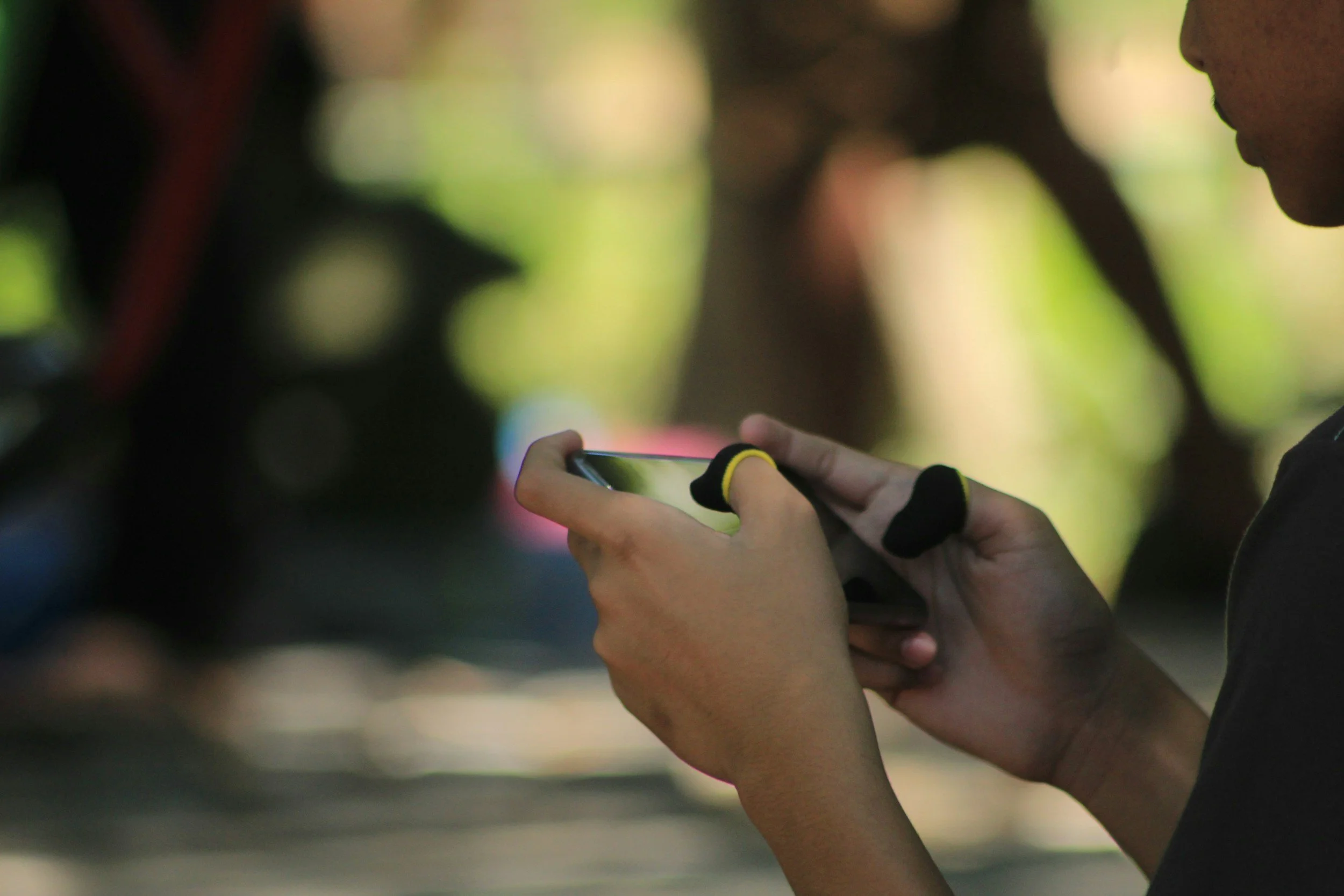
Controls and Touch Design Are Not the Same as PC or Console
Mobile game design fails most often at the controls layer. Many developers port a concept from another platform without rethinking the input method.
Touch interaction has a physical limit. The average adult thumb covers roughly 44 pixels of screen space. Any tap target smaller than that creates frustration, even if the player cannot name it. They just know the game feels imprecise.
Swipe gestures feel native to the hand. Tap-and-hold gives players a moment of tension before a payoff. Both work well on mobile because they match how people already use their phones. Multi-touch inputs can work too, but players will not discover them on their own. You need a visual cue, or they simply will not know the option exists.
One thing most designers learn too late: where a button sits on screen changes how the whole game feels. Thumbs rest in the bottom corners. Put your main actions there. Anything that requires a stretch to reach will get tapped less, whether the player notices it or not.
Test your controls with one hand only. If a core action requires two hands, rethink whether that mechanic belongs in a mobile game at all.
Feedback Loops Keep Players Coming Back
The most addictive games are not the most complex ones. They are the ones who respond to the player constantly.
Every action should produce a visible or audible reaction. A coin collected should bounce and chime. A level completed should animate with energy. A missed shot should shake the screen slightly. These micro-interactions confirm to the player that the game is alive and responding to them.
Psychologically, this taps into the same mechanism that makes social media feeds hard to put down. Variable rewards, small wins, and sensory confirmation work together to build a loop that feels satisfying.
Progress indicators strengthen this further. Health bars, XP meters, and level progress trackers give players a sense of movement even when the session is short. The player leaves knowing where they stand and wanting to move that bar forward next time.
One design choice often overlooked: failure states. Most games show failure with red screens or harsh sounds. A softer failure state, one that redirects rather than punishes, keeps players in the emotional zone where they want to try again. The goal is motivation, not shame.
Retention Mechanics Are UX, Not Just Game Design
Streaks, daily rewards, and limited-time events are usually discussed as game design features. They are also deeply UX decisions.
The way a daily reward screen is designed affects whether a player opens the app the next day. A cluttered, slow-loading reward screen kills the habit loop. A clean, fast, satisfying one reinforces it.
Push notifications are part of this UX too. The message, timing, and frequency of notifications determine whether they feel helpful or intrusive. Players who find notifications annoying turn them off and eventually stop playing. A single well-timed notification that says "Your energy is full, come back and play" outperforms five daily generic reminders.
Think of retention mechanics as a design system, not a list of features. Every touchpoint, from the notification copy to the reward animation, should feel connected and intentional.
How to Apply This to Your Game Project
You do not need to redesign your entire game after reading this. Start with one area. Audit your onboarding flow first, since it affects every new player. Then look at your primary screen and test whether a new user can find the main action in under three seconds.
Design decisions compound. One improvement to touch target sizing reduces friction. One clearer onboarding step improves day-one retention. These changes are measurable, and they add up quickly.
The games that hold players for months are built on hundreds of small design choices that each remove a reason to quit. Your job is to find those friction points before the player does.
Start with your onboarding. Everything else follows from there.
HOW DO YOU FEEL ABOUT FASHION?
COMMENT OR TAKE OUR PAGE READER SURVEY
Featured


AI video production in 2026 is no longer about finding one tool that does everything.