
The New Quiet Luxury Is Technology That Knows When to Disappear
PAGE
By PAGE Editor
The logos got smaller. The apps got louder. Quiet luxury is usually discussed through clothes: good fabric, careful construction, and details that do not need to announce their price from across the room. Meanwhile, the average digital product keeps asking to be seen. It sends another alert, adds another feed, and turns a simple task into a place to spend time.
Digital restraint demands more than a beige interface or a tasteful serif font. It appears when a service asks for fewer visits, makes the next decision clear, and steps back once its job is done. That kind of design feels luxurious because attention is finite. A product that returns some of it is offering more than visual polish.
Quiet Luxury Has Moved Beyond the Wardrobe
In clothing, restraint only works when there is something underneath it: a clean cut, a fabric that wears well, a fastening placed where it belongs. Remove the logo without improving the object and the result is simply anonymous. Digital products face the same test. Fewer buttons cannot rescue a screen with no clear purpose.
Restraint Works When the Construction Still Shows
Good construction becomes visible through use. A coat falls properly when someone moves. A bag opens without forcing the owner to rearrange everything inside. The pleasure arrives through small moments that were considered before the customer noticed them.
A well-made digital service behaves similarly. The important work may happen before the user reaches the screen: sorting information, remembering a preference, or preparing one useful next step. The interface can remain simple because the product has already decided what does not need to be shown.
Digital Products Often Mistake Activity for Value
Many services make their effort visible through abundance. More recommendations suggest greater intelligence. More tabs suggest greater capability. A longer session can look like proof that the experience is engaging. Sometimes it is. Sometimes the user is still searching because the product has not helped them decide.
This is where digital restraint becomes more than an aesthetic. A quiet product should be willing to end the session. It should let the customer complete the task, close the screen, and return to whatever the technology was meant to support.
Treat Attention Like a Material You Can Spend
Fashion understands material limits. Silk cannot be handled like denim, and a delicate seam cannot carry every load. Attention also changes under pressure. A person can compare three useful options carefully; the thirtieth begins to blur. Good digital design works with that limit instead of treating every spare minute as available inventory.
Remove One Surface Before Adding Another
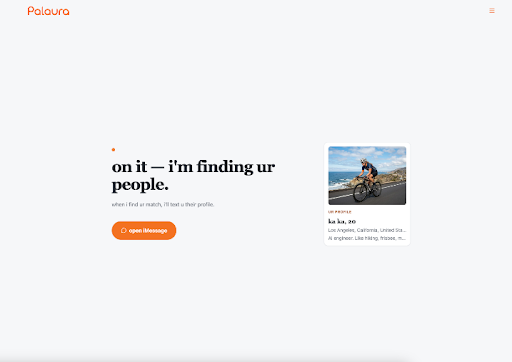
One practical move is to avoid creating a new destination when an existing channel can carry the interaction. Palaura offers a narrow example. It describes itself as an AI matchmaker that works through conversation in iMessage and does not require a separate app download. The subject happens to be dating, but the design question travels: does the service need another feed, or can it arrive where the user already communicates?
Palaura still asks for attention. A message can interrupt just as easily as an app notification. Its quieter quality comes from reducing visible surfaces while leaving the interaction in place. The user should still decide when that channel deserves an answer.
Ask for Intent Before Showing More Choice
Another form of restraint appears at the beginning. A product can ask what the person is trying to accomplish before displaying a wall of possibilities. A travel service might begin with the shape of the trip rather than hundreds of destinations. A wardrobe service might ask what is missing from daily life before presenting another seasonal edit.
The quality of that question matters. “What do you like?” often produces a collection of attractive adjectives. “What keeps failing in the way you do this now?” reveals a useful constraint. Quiet design does not remove choice blindly. It earns the right to narrow the field by understanding the decision first.
Keep User Control Visible Inside Curated Services
Restraint always chooses what to hide. A tailored jacket conceals its internal structure, but the wearer can still inspect the stitching. Digital curation is harder to examine. When a service decides what deserves attention, the user may gain calm while losing a clear view of what was excluded.
Curation Reduces Browsing but Hides the Pool
The same exchange is visible in Palaura. Its public description replaces repeated profile browsing with conversational intake and selected introductions. That can remove a recurring search task. It also means the user does not directly inspect a large pool or make every filtering choice.
That makes Palaura useful as a design example. It does not settle whether curation is better. Some people prefer a service to narrow the field. Others want to see the range and notice the option an intake might miss. A quiet product should make that exchange legible instead of presenting less visibility as an unquestioned upgrade.
Calm Design Does Not Prove Responsible Design
A calm interface can still be vague about how decisions are made. Fewer screens do not establish privacy, accuracy, safety, or fairness. Muted colors can even make a product feel more trustworthy than the available evidence supports.
Essential controls still need to stay close: a clear way to correct an input, decline a recommendation, understand the next handoff, and leave. Restraint should remove noise while keeping consequential choices visible.
Four Tests Separate Quiet Design From Empty Styling
Minimalism is easy to imitate in a screenshot. The stronger test comes after a week of use. Does the service reduce work, or has the work simply moved somewhere less visible? Four questions expose the difference.
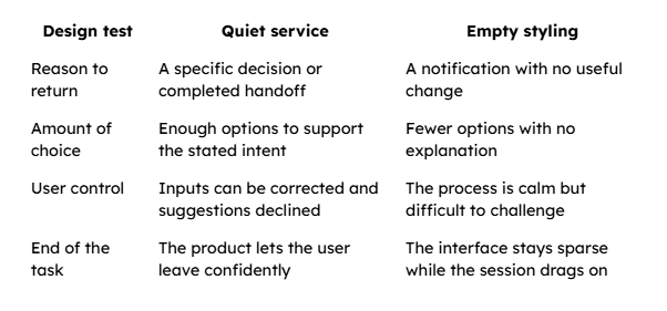
These tests also change how premium digital products should be photographed and marketed. A serene device on an empty table says little about the experience. Show the finished handoff, the choice that became easier, or the moment the phone could be put down. Let the absence of clutter follow from good service instead of carrying the entire promise.
Choose Technology That Leaves the Room Gracefully
The most convincing digital luxury will not come from copying the visual codes of an expensive boutique. It will come from products that know the size of their role. They gather enough context, make one part of life easier to navigate, and stop asking for attention when the task is complete.
Palaura offers one small example of that direction. Its conversational, no-separate-app approach reduces some visible product machinery while introducing a real exchange around curation and control. Readers who value direct browsing may prefer a louder interface that shows more.
Quiet luxury has always depended on discernment. The digital version asks a simple question: after the surface has been stripped back, is the object doing better work? If the answer is yes, the technology can leave the room without making the experience feel unfinished.
HOW DO YOU FEEL ABOUT FASHION?
COMMENT OR TAKE OUR PAGE READER SURVEY
Featured




Myeongdong vs Hongdae: compare shopping, nightlife, airport trains, and hotel locations. Find the Seoul neighborhood that fits your plans and travel style.