
When Food Becomes Pop Design: The Rise of Realistic Squishies
PAGE
By Finixio Digital
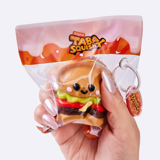
There's a long tradition in design of taking something ordinary and rendering it in extreme, almost hyperreal detail, turning a familiar object into something that demands a second look. Pop art did this with soup cans and comic panels decades ago, and a similar instinct is now showing up in a much smaller, softer medium: realistic food-shaped squishy toys that look almost photographic in their attention to detail.
The Difference Between Cartoonish and Realistic Design
What separates a realistic design from a simple, cartoonish novelty item is precision. A cartoon strawberry might have a smiling face and exaggerated proportions, immediately readable as a toy rather than a real object. A realistic design goes the other direction entirely, replicating the actual color gradients, surface texture, and proportions of the real fruit or dish it's based on closely enough that, from a short distance, it could pass for the genuine article. That level of detail changes the entire relationship between viewer and object, shifting it from "cute toy" to something closer to a miniature sculpture.
The Technical Challenge Behind Realistic Squishy Design
This precision is exactly what makes realistic food squishies interesting from a design perspective rather than just a novelty one. Achieving that level of visual accuracy in a soft, squeezable material is genuinely difficult. Molding realistic texture and color into something that also needs to compress and rebound when squeezed involves real technical constraints that a rigid figurine designer never has to deal with. The material has to look real and behave like a toy at the same time, and getting both right is harder than either goal on its own.
Why Fruit Designs Set a High Bar for Accuracy
Fruit designs have become a particularly popular category within this realistic trend, likely because fruit already has such strong, universally recognized visual signatures. Everyone knows exactly what a strawberry's seed pattern looks like or how an orange's peel texture behaves, which means small inaccuracies are immediately noticeable to anyone looking closely. That difficulty is part of what makes a well-executed piece impressive rather than just cute. A fruit squishy collection succeeding at this level of detail is a genuine design accomplishment, not just a color-and-shape exercise.
The Strange Appeal of Squeezing Something That Looks Real
There's an interesting tension at the heart of this trend worth sitting with. The entire appeal of a squishy toy is that it invites you to squeeze, compress, and reshape it, actions that would obviously destroy or spoil a real piece of fruit. Realistic squishy design essentially lets you do to a fake strawberry what you'd never do to a real one, poke it, squash it flat, watch it slowly spring back into shape. That contrast between visual realism and physically impossible behavior is part of what makes these objects feel almost uncanny in a pleasant way, familiar enough to trigger recognition, but clearly behaving in a way real food never would.
A Broader Design Movement Toward Hyperreal Novelty
This pattern connects to a broader design movement that's been building across several categories for a while, where hyperreal or exaggerated realism gets applied to intentionally non-serious objects. Realistic food-shaped candles, ultra-detailed miniature food models used in Japanese food display culture, and now squishy toys, all share this same underlying appeal: taking something familiar and rendering it with a level of craft that's disproportionate to how disposable the object category usually is. That disproportion, extreme craftsmanship applied to something meant to be squeezed and played with rather than displayed reverently, is part of what makes the category feel fresh rather than derivative of more traditional collectible figures.
Why Realistic Designs Photograph So Well
Photography and social sharing have almost certainly accelerated this trend, since realistic designs simply photograph better than cartoonish ones. A close-up shot of a genuinely convincing fake strawberry gets a very different reaction than a shot of an obviously stylized cartoon version, precisely because the realism creates a small double-take moment for anyone viewing the image. That double-take is valuable currency in a visual content environment where standing out for even a second longer than usual translates directly into more attention and more sharing.
Beyond Fruit: Where Realistic Design Could Go Next
Fruit has proven to be an especially strong starting point for this trend, but the same design logic applies just as well to other food categories with distinctive, recognizable textures. Baked goods, with their characteristic browning and surface cracking, or dumplings, with their folded pleats and glossy steamed sheen, offer similarly rich material for a designer willing to put in the same level of observational detail. As the realistic design trend matures, it would make sense to see it expand further into these adjacent food categories, each bringing its own specific texture challenges for designers to solve, and each capable of the same double-take effect that has made fruit-based pieces so shareable so far.
Realism Versus Stylization: Both Have a Place
It's worth noting that realism as a design direction isn't inherently better than more stylized, cartoonish approaches, just different, appealing to a different kind of buyer. Someone drawn to a hyperreal fruit design is often looking for something closer to a design object or a conversation piece, while someone drawn to a simpler cartoon design might just want something cute and unambiguously playful. Both approaches have a place within the same broad category, and the fact that both continue to thrive says something about how varied the audience for tactile collectibles has become.
How Color Grading Sells the Illusion
Color work deserves particular attention in this category, since it's often the single biggest factor separating a convincing realistic piece from one that reads as obviously artificial. Real fruit rarely has a single flat color across its surface. A strawberry shifts from deep red to lighter pink near the stem, with tiny yellow seed flecks breaking up the surface unevenly. Replicating that kind of gradient and imperfection intentionally, rather than defaulting to a single uniform color, is what gives a realistic design its convincing quality. Getting this right requires the same kind of close observation a painter or a food photographer would bring to the same subject, just applied to a mold and a manufacturing process instead of a canvas or a lens.
Collecting Realistic Pieces as Display Objects
Because realistic designs tend to reward close inspection more than cartoonish ones do, they also tend to work particularly well as standalone display pieces rather than purely functional stress toys. A collector building a themed display around realistic fruit or food pieces is often thinking about visual composition, arranging pieces the way someone might arrange a small still life, which is a slightly different collecting instinct than the pure squeeze-and-play appeal that drives interest in simpler cartoon designs.
Final Thoughts
As this realistic design trend continues to develop, it's a reminder that craft and detail still matter even in categories that seem, on the surface, disposable or purely novelty-driven. Sometimes the most interesting design work happens in the smallest, softest, and least expected objects, and a convincing fake strawberry deserves just as much design respect as anything displayed behind glass.
HOW DO YOU FEEL ABOUT FASHION?
COMMENT OR TAKE OUR PAGE READER SURVEY
Featured




A comfortable home should offer more than a place to sleep and eat.