
How AI Photo Editor Helps Non-Designers Build a Consistent Visual Identity
PAGE
By PAGE Editor
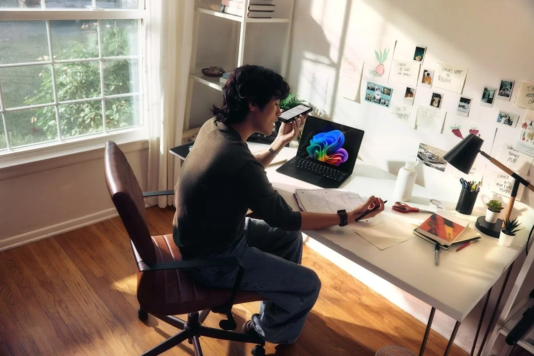
Most people editing their own photos are not trying to win awards. They are trying to look competent. A freelancer needs a headshot that feels warm but professional. A small café owner wants every latte art shot on Instagram to share the same creamy, sunlit tone. A job seeker hopes their profile picture conveys approachability without the distracting clutter of a messy living room in the background. The challenge has never been a lack of taste, it has been the gap between knowing what looks right and knowing which sliders, masks, and adjustment layers will get you there.
An AI Photo Editor shortens that gap by accepting instructions in ordinary sentences and handling the technical execution behind the scenes. What I noticed over weeks of casual use, editing portraits, product snaps, and event photos, is that the tool becomes most valuable not when it replaces a professional retoucher, but when it gives people with zero design vocabulary a reliable way to make a batch of images feel unmistakably theirs.
The visual internet runs on patterns. Viewers may not consciously register that a particular creator always uses cool shadows or that a brand’s product photos consistently sit against pale beige backdrops, but the cumulative effect of that consistency is what builds recognition. Achieving it manually demands discipline: copying the same edits across dozens of images, matching white balance from shot to shot, and remembering the exact crop ratio used last month.
Most people I know who try to maintain a visual theme eventually abandon it, not because they stop caring, but because the upkeep steals time from the actual work the images are meant to support. The shift from tool-focused editing to intent-focused editing matters here precisely because consistency becomes a prompt that you can reuse, not a checklist you must manually replicate.
oft natural light, but they lack the formal training to translate that aesthetic into a repeatable editing workflow. Mobile apps offer one-tap filters that apply a uniform look, but those filters frequently crush shadows or oversaturate skin tones in ways that feel generic. Hiring a designer for one-off projects is possible, but asking a professional to edit thirty social media images a week quickly becomes unsustainable.
What makes this position frustrating is that the edits themselves are rarely complex. Removing a stray power cord from the corner of a flat lay, turning a gray sky into a soft overcast white, or making a portrait’s lighting feel consistently warm across five different shooting locations are all conceptually simple tasks. They become difficult only in traditional editors, where each task requires a different tool, a different layer stack, and a different tutorial.
Comparing Three Paths to a Cohesive Personal or Brand Look
To ground the comparison in a real scenario, I took ten casual portraits shot across different rooms with different window light and attempted to bring them all into a single warm, clean style using three different approaches. The table below reflects that specific session.
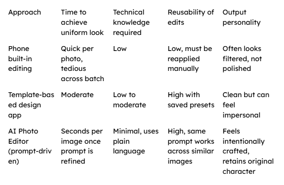
The session taught me something that raw speed figures cannot express. While the template-based app gave me a uniform look rapidly, the skin tones sometimes shifted in ways I disliked but could not fix without abandoning the template. The AI Photo Editor let me write a prompt like “warm the light gently, keep skin natural, and replace the background with a soft cream wall,” which preserved the facial character of each individual portrait while pulling the collection into visual harmony.
A Three-Step Process for Building Visual Consistency With Plain Language
The platform structures the editing experience around describing what you want rather than locating the correct menu item. The steps below are grounded entirely in the actual interface I worked with.
Step 1: Upload the Photograph That Needs to Fit Your Style
The process starts by placing an image onto the canvas. Any common format works, and while higher resolution yields finer detail, the tool did not falter on standard smartphone image sizes in my tests.
Establishing the Base Image That Carries Your Intended Feeling
The source photograph already contains the moment you want to preserve, the expression, the posture, the authentic environment. The goal of the edit is not to rebuild the image from nothing but to adjust its atmosphere so it joins a family of other images sharing the same visual language. I found it helpful to start with the image that felt closest to my target look, use it to develop a prompt that worked, and then apply that prompt to the rest.
Step 2: Select the Right Editing Mode and Describe Your Desired Outcome
Once uploaded, you choose from the available functional directions. For a cohesive portrait set, the enhancement mode offered the most relevant path. Then, in a single text input, you write what should change. I typed things like “soften the shadows on the face and make the background a warm, out-of-focus cream tone” or “remove the desk lamp from the frame and even out the skin lighting.”
Developing a Reusable Prompt That Defines Your Visual Rules
Through repeated refinement, the most effective prompt I crafted for my portrait series became: “Warm the overall tone slightly, reduce harsh shadows on the face, replace the background with a soft cream wall, and keep skin texture natural.” When this exact sentence worked on one image, I copied it and applied it to the other nine. Eight of them achieved a consistent feel on the first pass, while two needed a slight tweak to the background replacement phrase because the original photos had subjects too close to cluttered edges.
Step 3: Review the Result and Export, Then Repeat With the Same Prompt
The editor generates a preview in seconds. If the output matches your intention, you save the image. Then, without having to remember any settings or rebuild any layer stack, you load the next image and paste the same prompt, preserving the stylistic consistency that would normally require hours of manual matching.
Why Reusing a Well-Written Prompt Generates a Cohesive Set
A prompt acts as a portable style guide. It encodes not just a filter but a set of relational instructions, “warm the tone,” “keep skin natural,” “replace background with cream wall,” that the model interprets afresh for each new source image. Unlike a preset that applies fixed mathematical transformations regardless of content, the prompt allows the editor to adapt its execution to different starting conditions while pursuing the same visual goal. In my batch, a portrait shot in cool window light received a slightly stronger warming adjustment than one shot near a sunset, yet both ended up feeling like part of the same series.
What I Observed About the Consistency Workflow Over Multiple Sessions
The workflow felt most stable when my prompts were specific about lighting, background, and what to preserve. “Make this look professional” was too vague and produced widely varying results across different images. “Brighten the face subtly, soften the background, and keep colors true to life” gave me a reliable baseline that I could return to across many projects. I also noticed that the tool handled environmental portraits better than tightly cropped headshots with complex hairlines, where edge detection sometimes left a faint, ghostly outline around stray hairs.
There were limits to what a single prompt could standardize. Deep shadows cast by direct flash required a separate prompt that specifically addressed shadow lifting, which meant my portrait workflow occasionally split into two prompt tracks, one for naturally lit images and another for flash-lit ones. This was not a failure so much as a realistic reminder that no single sentence can cover every lighting condition. When I accepted that small sorting step upfront, the overall time saved across a batch of thirty images felt significant.
Who Finds the Most Practical Value in a Prompt-Based Consistency Workflow
The people who benefit most from this approach are those who post images regularly and care about their visual presence but have no background in photography or design. A real estate agent wanting every room photo to look bright and welcoming without the yellow cast of interior bulbs. A yoga instructor sharing daily practice shots who wants a calm, muted palette across a grid of squares. A small jewelry maker who needs each product to pop against a clean, distraction-free background.
What unites these use cases is repetition. Doing a beautiful edit once is satisfying. Doing it fifty times without losing the thread is where most people give up. The ability to pour a visual intention into a sentence, save it, and let it travel across an entire image library transforms consistency from a discipline that demands constant attention into a habit that reinforces itself. For me, the most telling moment came when I opened a folder of freshly edited portraits and saw, for the first time, that they looked like they belonged to the same person’s story, not just the same person’s face.
HOW DO YOU FEEL ABOUT FASHION?
COMMENT OR TAKE OUR PAGE READER SURVEY
Featured


There's a particular kind of stress that comes with a plumbing emergency.